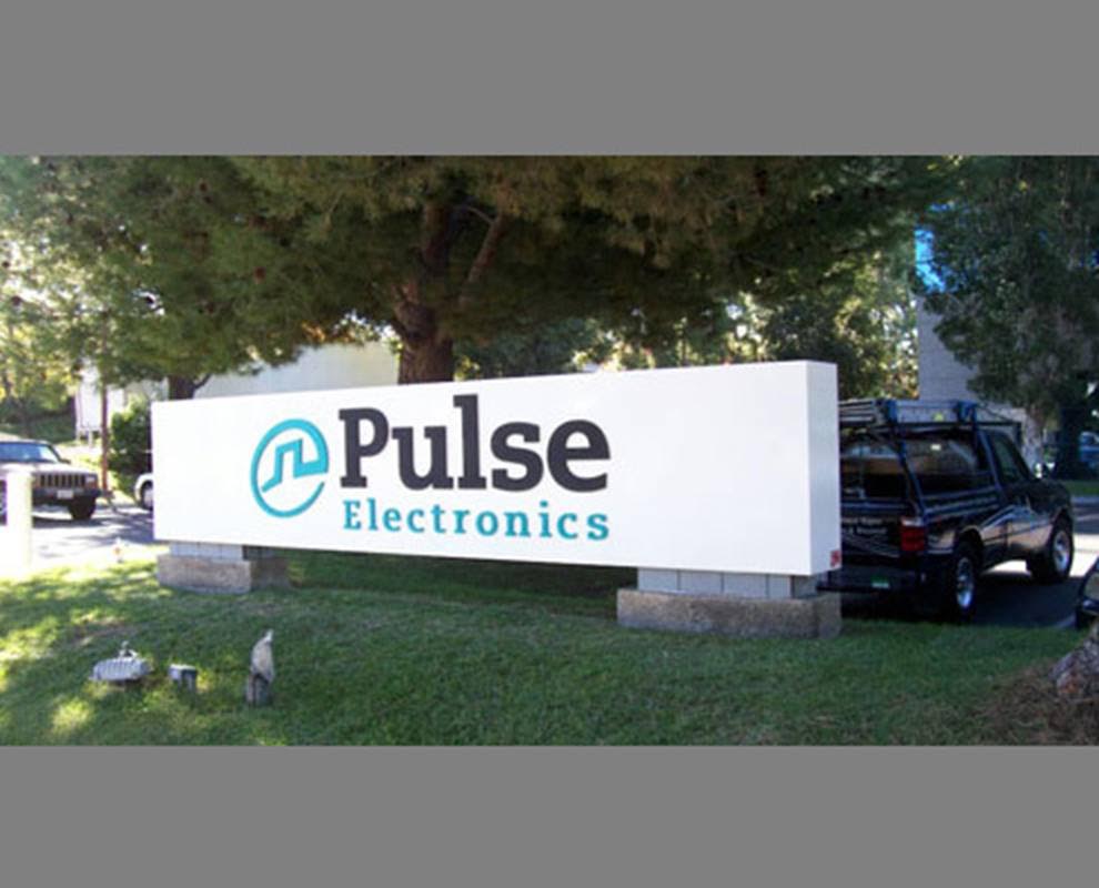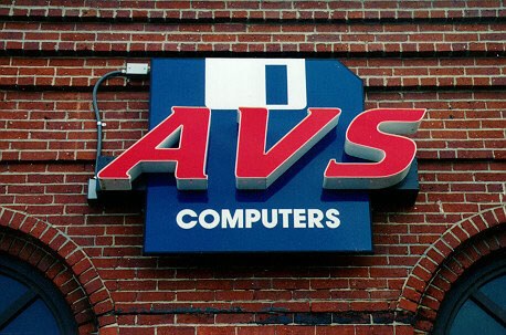
The first sign order is exciting. You see your name in lights, so to speak, for the first time. But there are pitfalls. When ordering exterior business signage in Indianapolis IN, it pays to work with a set of professionals who can guide you along the way. These friendly folks can help you avoid some of the most commonly made mistakes.
1. Small Fonts Make Signage Difficult to Read
 We conduct site surveys before giving an opinion on the letter height for any location. The reason is simple: drivers. The speed with which motorists drive past your location determines how tall the letters need to be for them to be able to read information in the two to three seconds they have. Make a mistake here, and your customers keep on driving past your business. Some may turn around; others will not.
2. Lack of Clarity Turns off Prospective Buyers
Spell out your niche. Unless you have a devoted clientele that knows exactly what hides behind a one-word moniker, we suggest adding a brief explanation. For example, “Dot’s” could be anything. Spell out if it is a boutique, bakery, pet supply store, or hair salon. Unless a consumer is truly adventurous, s/he will not stop in to learn more about your company.
3. Information Overload Leads to Data Clutter
 On the other side of the equation, you have data overload. If you have display windows that show clearly what you sell or offer, a niche explanation may not be necessary. The trick here is to temper the need to inform with the actual display opportunities your venue features. Once again, a site survey is instrumental in providing you with the feedback you need to make an informed buying decision. Our experts assess your location, make a note of signage used by nearby businesses, and then provide you with options that ensure you stand out in all the right ways.
4. Script Fonts and Text Effects Cause Problems
On your website, the old-English font and text effects look fun. When you make them larger and place them on a variety of exterior signs, they detract from your professional message. Rather than translating an element of fun into the building sign and other marker applications, they make the display look less than expert. Striking a balance here can be difficult. We frequently work with business clients who need assistance with the creation of a corporate logo and lettering presentation that hints at the online or in-store ambiance without compromising legibility.
5. Missing Color Contrasts
 Your façade is off white. Your lettering is beige with white edges. There is little in the way of contrast. We can fix that and let you stay true to your corporate color palette. Something as simple as a board behind your building letters can provide the needed color contrast that lets you feature the tones you like on a surface that would otherwise hide them.
Learn More about Building Signage in Indianapolis IN
If we have piqued your interest in finding out more about signage mistakes to avoid, we gladly help. Contact our experts today with any questions you might have!


